About Me

My photo
Nashville, TN, United States

Sunday, November 21, 2010

Roman and Early Christian Art


The Basilica Ulpia, built by Trajan, was perhaps the most important basilica in Rome. It featured shops and a courthouse and served as a center for justice and commerce. The Basilica Ulpia contained a large central nave with a rounded apse at each end that served as the judge's seat, and at one point likely had a highly decorated interior.  Marble columns created four side aisles (typical of the basilica structure), and there were clerestory windows that let in light and created a sense of importance and respect.


The Church of Santa Sabina, constructed between 422 and 432, is a perfect example of a typical Early Christian basilica. It has a simple brick exterior, contrasted by the elaborate marble interior. The church is lit by clerestory windows which bathe the interior in a heavenly light and evoke feelings of respect and awe. There are 24 columns inside, topped by Corinthian capitals that are spolia from earlier pagan buildings, and they support rounded arches. The nave of the building is flanked by single side aisles created by the columns and ends in a rounded apse. The inside of the church is decorated elaborately and features depictions of Christ as a shepherd, as well as laurel branches that symbolize God as a provider.

Early Christian art and architecture greatly resembled that of the Roman Empire. This is partly due to an ongoing sense of membership to the Roman Empire during this period of time, and the similarities between the Basilica Ulpia and the Church of Santa Sabina are examples of this. Both buildings were places of community gathering; the Basilica Ulpia served as a courthouse, while Santa Sabina provided a large place of worship for the growing Christian community. Both buildings have a similar structure and employ the use of clerestory windows to create an emotional effect with light. Christians modified and adapted the Roman style to fit their needs, and the Basilica Ulpia provided a model for many future churches. Roman art and portraiture was based on an idea of realism (and an oftentimes false sense of individualism), while Early Christian art was dominated by symbolism, for the meaning of the depiction was often more important than the physical appearance itself. Rather than being a mere visual representation of a subject, Christian art served as a way of telling the largely illiterate public about Jesus' life and teachings. Thus, this period of time involved a shift from an emphasis of mankind and human activities to a focus on the divine. This is shown in the architecture as well, for there was an increase in the construction of churches and baptisteries.

Friday, November 5, 2010

Pictures from the Parthenon

Athena Parthenos

Statue of the Athena Parthenos.

Athena was considered to be the founder and protector of Athens; the Parthenon was dedicated to her and served as her temple. The Athena Parthenos statue within the Parthenon is representative of the Greek ideals, and Athena was believed to have helped Athens emerge victorious in the battle with the Persians. She is massive, which shows importance, and she was made of ivory and gold, two extremely expensive materials. The Athena statue is an embodiment of the Athenian achievement: she holds Nike, the goddess of victory, in one hand, and the other hand grasps a shield.


Close-ups of shield.


Western Pediment

Eastern Pediment


The sculpture and relief work of the Parthenon, both representing the triumph of order over chaos, are evidence of the effects of the Persian sack (and subsequent Greek victory) on Greek art. The western pediment depicts the contest between Athena and Poseidon for the control of Athens, and the eastern pediment shows the birth of Athena. The figures of these pediments are classical; they are sculpted in the round and, though the pediments are triangular, the figures look neither awkward nor forced. They all flow together to create one united scene.

Ionic Order

Saturday, October 30, 2010

Greek Pottery


This amphora is believed to have been created by the Berlin Painter, who is considered to be one of the most talented vase-painters of his time. He helped develop the Classic style of red-figure pottery, and he likely trained many younger painters as well. This tall vessel was probably used to hold or transport water, food, or wine.

One of the Berlin Painter's signatures was the abandonment of patterns and panels, and the figures on the amphora are in perfect harmony with the curvature of the vessel itself. The figure on the left is a musician playing a kithara, an instrument used for formal performances in festivals and contests that consists of seven strings and a wooden body. He is wearing a long, flowing garment, the lines of which create both tranquility and movement to the rhythm of the imagined music. The strain in his neck and his open mouth show the passion with which the kitharode is singing. The figure on the other side of the vase listens (or judges) the kitharode and extends his arm to the singer. Instead of using patterns and panels with intricate decoration, the Berlin Painter created a simple scene of two figures against a plain black background. Still, he managed to create a sense of emotion and passion with the two figures.

This amphora is an example of red-figure pottery. The red figures on a black background were created by applying a glaze to the negative space around the figures. When the vessel was placed in a kiln, the glazed areas turned black, which created a strong contrast between the foreground and background. This particular amphora stands out because of its striking simplicity compared to the others featured on the Met website.

Thursday, October 14, 2010

Individual Blog #3


http://online.wsj.com/article/SB10001424052748703384204575509823111367854.html?mod=WSJ_ArtsEnt_LifestyleArtEnt_4

This article discusses an artist named James Magee, who is considered to be the "America's greatest living unknown artist." Magee is extremely eccentric and unconventional: he creates art under several alter egos, including "Annabel Livermore," a painter. Under his real name, he creates pieces of wall art, which are so elaborate and heavy that any buyer would have to build a wall or industrial space to put them on. However, his most impressive and secretive project is The Hill, which has been under construction for more than 30 years and is still unfinished. It is a combination of architecture, sculpture, art and landscape, consisting of four 14-foot-high, flat-roofed buildings sitting atop two stone causeways. All materials are either stone or metal, and each building has fiberglass panels to let in light. The article describes the Hill:
The south, north and east buildings house a variety of sculpted shapes—vertical triptychs, altars, panels—all composed of industrial materials and filled with glass, cloth, metal, something that suggests an animal's flayed body, and various other detritus. The most spectacular installation is the horizontal floor sculpture in the east building. This vast piece is capped by a glass-and-metal cover that took four men 15 minutes to raise via a set of clanking pulleys. It looks like a lunar landscape designed by Corbusier and made of iron and steel objects, broken glass, ball bearings, beads, metal shavings, all arranged into shapes that remind us of things we know (a chair? a body? a road map? a destroyed city?) but have never seen before. It is a map of the imagination.
When the chapel doors are open, you look through them and out to framed desert vistas, the same scenes you can see as an encompassing panorama once you step away from the buildings. The untended cacti, agave, yucca and delicate desert flowers seem as deliberate as anything at Versailles.
I think this is SO COOL. The article's description of The Hill says that "Nondoctrinal religion, a pervading spirituality, defines the place and the experience of being there. Mr. Magee is the creator, the servant, the priest and—for the most part—the congregation." This definitely relates with our class discussion about the Horowitz article and the properties of architecture. From the description, the feelings evoked by the architecture seem to be awe, inspiration, and a sense of being dwarfed by the space (almost like the church that we visited). It really sounds like an amazing experience, and I wish that it was more open to the public.

For more info on The Hill, visit
http://www.mageehill.org/

Individual Blog #3


One of my favorite pieces from class this week is this funerary krater. Its design is typical of the Geometric period, which is characterized by the use of linear motifs such as spirals, diamonds, and cross-hatching.
In its time, this piece would have likely been used as a grave marker, and it was found just outside the Diplyon Gate at the ancient cemetery of Athens. The geometric style is seen all over the krater: in several bands that circle around the top and bottom, and in the background of the scene depicted. This repetition creates a sense of rhythm and unity throughout the piece.

The scene on the krater shows a detailed record of funerary practices of the Greeks, including cremation. On the top register, the body of the deceased is shown about to be cremated. The people around the deceased have their arms raised in a gesture of pain and sorrow. Their forms are extremely geometric-looking: their heads and torsos are triangles, their arms and legs are rectangular. There is no depth in this work; the geometric figures actually emphasize the flatness. The contrast between the crisp black designs and the lighter colored ceramic is also typical of the period, and it really makes the scene stand out. The simple colors also allow such an elaborate design to be easy to look at: it doesn't overwhelm the eye.

Sunday, September 26, 2010

Group Blog #1


Having seen the outside of the Downtown Presbyterian Church for years, I never expected the inside to look the way it did! The building blends in well with the others around it, and the location and outer appearance give no hint about the elaborate inside decor. The church isn't extremely large, but inside, it feels massive. The high ceilings and huge windows, large furniture, and tall pillars absolutely dwarf a person inside. This creates a sense of importance and respect. Everyone in my group didn't expect the inside of a church to be so elaborately made to look like ancient Egypt, and we were all in awe of the amazing detail of the walls, stained glass windows, and painted ceiling. It almost felt like a museum, or like we were stepping into a whole other time and place. The sturdy wooden furniture really gives the impression of strength, which is expected in a church, and the dim lighting (although I'm sure it's not always lit like that) added to the feeling of reverence and foreignness while we were there.

The stained glass windows had yellow sand, bright green palm trees, and blue sections representing the Nile River. There were even representations of papyrus plants. The windows are meant to make the viewer feel like he or she is looking out into Ancient Egypt, and to me, they definitely added to the foreign feel of the church.


My absolute favorite part of the church was the trompe l'oeil near the altar. The walls were painted to look as if they were a patio looking out onto a hypostyle hall. The detailing on the columns stayed true to Egyptian style, and the trompe l'oeil was very well done. The rhythm of the repeated columns added to the vast feel of the room.

Overall, I wish I could have explored the church more thoroughly. The back room with a bit of the church's history was very interesting. It's nice to have a little part of Egypt in our city!

Thursday, September 16, 2010

Individual Blog #2


This article from CBS News discusses a new exhibition at the Seaport Museum of New York that consists of Alfred Stieglitz's photographs of Old New York. It features 39 photographs, shown together for the first time in nearly 80 years. In this new exhibition, Stieglitz's old photos are placed so that his images of Old New York are contrasted with his later images of the city. Another section in the exhibition called "The Face of New York" contrasts Stieglitz's material with works by his contemporaries and is used to show the wide variety of New York imagery at the time.
I thought this was an important article to write about, not only because Stieglitz is one of my favorite photographers, but also because he has had a huge impact on the American art world. His gallery "291" introduced America to the likes of Picasso, Cezanne, Matisse, and Rodin. Additionally, he was one of the most prominent proponents of photography as an art form, promoting photography as "a distinctive medium of individual expression." It's interesting to think that photography once wasn't considered a true art form, and this article brought my thoughts back to my previous assignment about the artistic nature of video games. It just reinforces the fact that the definition of art is fluid and constantly changing, and different mediums evoke different responses.


Individual Blog #2


These votive figures from Tell Asmar really stood out to me when we viewed them in class. These voluminous figures are typical of their time period and follow conventions that were common in Sumerian art. They are sculpted in-the-round (sculpted on all sides except for the base) and vary in size and slightly in appearance. The figures are extremely stylized in both face and body, there is little definition of gender, and the clothing and poses really emphasize their heavy, cylindrical shape. The figures all share a common pose and expression, their hands prayerfully folded and their faces peaceful and reverent.

However, the eyes on these figures are what really catches one's attention. The large, wide-eyed stare that we now associate with cartoon characters was once considered a look of deep devotional prayer. In the textbook, the author states that "[these figures] are directly related to an ancient Near Eastern devotional practice in which individual worshippers could set up images of themselves in a shrine before a larger, more elaborate image of a god (31)." Therefore, these statues represented real people and allowed them to be in constant "eye-contact" with their god. This tells us, the modern viewers, a lot about the Sumerian people: it shows how important their religion was to them and gives us an idea of their everyday worship practices.

Thursday, September 9, 2010

Collage project


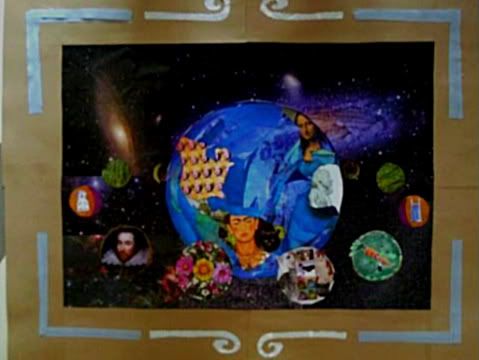
I'm sorry for the awful cell phone picture!

For this collage, I wanted every inch of the poster board to reflect some part of me. I always knew that the main theme would be astronomy, as it is a very important part of my life and one of my biggest passions. I decided to use the concept of a globe with orbiting moons, with each moon representing a facet of my personality. The two largest moons stand for my cats and my parents, both of which are probably the most important to me. The moons go on to show my other interests: nature (the man with the carrot as a representation of my longtime vegetarianism and love of the environment), the humanities (I‘m an English literature major), and my hometown. Art means the world to me, so I thought it fitting that each part of the globe should be represented by a famous work of art. The frame around my collage is important as well; it has a symbolic meaning of structure and practicality.

Decisions: As stated in the paragraph above, I tried to be very careful in my decisions for the collage. I planned everything out beforehand, yet the collage looks slightly different from what I planned. This is a good thing! Whenever I finish a piece of art, I recognize that parts of it reflect my feelings at the moment of creation and couldn’t have be planned.

Color: The colors in my collage are both bright and subdued. The bright blues and greens represent my love of nature and the sciences, while the browns represent simplicity and practicality, as well as my love of antique things.

Light: The lighter areas in my collage are meant to draw the eye throughout. I tried to balance the brightness of the Belmont bell tower and Shakespeare’s forehead on the left with the lightness of Africa on the globe and the bright nebulae in the background on the right. The brightest nebulae in the background also “point” to the main focus of the globe.

Texture: Texture is most evident in the “ocean” on my globe. I used pictures of water to create a texture similar to real water. Texture can also be found on several of the moons: the grassy look of the four farthest moons and the “vegetarian” themed moon.

Volume: My use of volume is also most evident on my globe. I tried to create roundness by using the darker scraps of paper along the edge of the globe and gradually fading to lighter. The implied roundness of the globe is meant to be a contrast with the rather flat moons.

Line: The axis of my collage is primarily horizontal, though there is a slightly elliptical orientation as well, used to make the moons look as if they are rotating the Earth. Several other lines are meant to draw the eye to the globe: the man with the carrot and the nebulae in the background all “point” to the focal point.

Space: I tried to create depth with the starry background. The darker parts and nebulae are supposed to be very far away compared to the globe. The moons are arranged so that the smaller ones are farther away than the larger ones.

Scale: The size of the objects in my collage determine their importance to me at this time in my life. The moons representing my family and my cats are the largest, followed by my two biggest interests-- science and literature. The next two largest represent my hometown and school, and the farthest moons represent the future. Though the future is very important, I try not to let it dictate my day-to-day life too much.

Symbolism:
1. The frame around the main part of my collage represents my need for structure in my life.
2. The swirls on the frame are made up of words, which symbolize my love for reading and writing. The spiral shape is significant because I tend to dive into whatever I’m reading and “get lost!”
3. The orbiting moons symbolize “moving forward” and discovery, for real moons are always moving.
4. The four farthest moons symbolize my four years in college, as well as the future. They are smaller and dimmer than the other moons, which is meant to imply uncertainty. However, they have a grassy texture, which is meant to represent level-headedness (“Keep your feet on the ground.”)

You: The main theme of the collage is (obviously) astronomy, which is one of my passions. Each one of the moons represents some aspect of my personality: the Shakespeare portrait shows my love of the English language, the man with the carrot is representative of my longtime vegetarianism and interest in nature, and the cats represent my own cats, whom I adore.

Friends and Family: My family is represented by the moon on the bottom left of the collage. There are three flowers, one each for my parents and me. The flowers are significant because our family is very into gardening, and we all work together to keep our yard and garden looking nice. It’s one of the many ways that we spend time together, and for that reason it is significant.

Your town, community, school: My hometown (Nashville) and my school (Belmont) are on the far right and left of the collage. Both have had a great influence on me, which is why they are place rather high on the collage.

Your country: On the globe, America is represented by Warhol’s portraits of Marilyn Monroe. This is important because it represents a very popular and well-known period of American art and film.

The world today: The globe in my collage represents the world today. The swirling movement of the water gives the impression of chaos, but the blue color represents brief moments of peace.

Art: As shown on my collage, art is very important to both myself and the world! Art, to me, makes the world a better place, and without it, life would be very dull.

History: Art is a crucial part of human history. It is ingrained within all of us, and it has given rise to innumerable forms of self-expression. Everyone shares a common world history, and art is just one aspect of it. By using a famous art piece from each part of the world, I tried to show just how widespread and important art is to history.

Thursday, September 2, 2010

Individual Blog #1


Hmm... looks like art to me!

http://www.cnn.com/2010/TECH/gaming.gadgets/08/31/video.games.art.steinberg/index.html?iref=allsearch

This article from CNN.com discusses the debate on whether or not video games should be considered an art form. The author is trying to convince the reader that a video game is an artistic experience, and he compares gaming to looking at more "traditional" art. He states:
Sure, the swirls of Van Gogh's "Starry Night" or the magnificence of Michelangelo's statue of David can prompt awe and contemplation in onlookers. But should we think any less of sprawling virtual worlds that marry music, literature and graphics into a layered aesthetic experience filled with countless scenes, scenarios and choices open for individual interpretation? 
I had never really thought about video games in that sense, but after reading this article, I do agree that video games are a form of art and should be considered as such. I personally am not a "gamer," but I do know that an enormous amount of effort goes into making video games, and they have a strange and inexplicable effect on those who really get into them. Video games are accessible. They bring art and the resulting passions and emotions into one's own living room, and the interactive nature allows the player to dive right into a new world.

From an outsider's perspective, I do think that there is an often-overlooked artistic value to video games, and I think that it should be acknowledged. I don't play video games, but I recognize and appreciate that fact and the idea of accessible art. However, I don't think that the artistic nature of video games can ever replace the traditional notion of art that we have had for centuries, and it shouldn't. Computer-generated forms and landscapes are art in their own right, but they just aren't the same as the actual physical act of putting a paintbrush to canvas. Someone wouldn't compare a dance with a painting in order to validate whether or not each should be considered "art" because they are completely different. I think that video games should be given their own independent category, interactive visual art, instead of being put in a category with other types of visual art. It just makes sense!

Individual Blog #1


Thomas Eakins' The Biglin Brothers Turning the Stake is a great example of an artist's use of axes to organize and move one's eye through a painting. The obvious horizontal axes of the horizon and boats in the background create a calming effect, reinforced by the shimmering stillness of the water. In contrast, the slightly diagonal boat in the foreground adds a bit of movement and interest into the painting; one can almost see the two men rowing past and out of the frame. Additionally, Eakins uses the perpendicular lines of the flagpole and the boat to draw the viewer's eye to the focal points, the rowing Biglin brothers. Eakins also does this with color, for the deep, royal blue of the flag and the men's hats are the same, and the tip of the flag seems to be pointing at the brothers. The reflections of the men also draw one's eye up to their actual forms. Another notable technique is Eakins' impressive illusion of depth and atmospheric perspective. The textured, hazy clouds and trees in the background create movement and really emphasize the clearer lines of the two men.

While looking at this painting, I began to notice an enormous amount of triangles, most of which I have outlined in the picture below. They all seem to contain or point to the focal point, the Biglin brothers. According to Horowitz, a triangular composition is evidence that "the painter has gathered random movements into a moment of perfection."  I thought it was interesting!


Using Prown's ideas about Material Culture and looking at the painting objectively, one can determine several things from this work. First, the realistic and skillful use of perspective, line, and form indicate that Eakins was trained in his profession, showing the viewer that the artist must have lived in a society that supports and/or values artistic endeavors. There is a steaming ship in the background of the painting, indicating that the work was created in an industrially-advanced time period and a rather prosperous country. Additionally, the event that the painting portrays and the large crowd in the background are indicative that the artist lived in a culture where there was an emphasis on sports and recreational activities. This again insinuates a wealthy country because a person in poor living conditions would likely have not experienced an event such as this.

Wednesday, August 25, 2010

Blog assignment #1


One of my very favorite paintings is Georges de La Tour's The Magdalen with the Smoking Flame. I first saw this painting in my Art History class during my sophomore year of high school, and I was in awe of the subtle, realistic-looking candlelight and the dark, rich colors. It's just so beautiful and intriguing! I want to know what she is thinking about. The pensive look on the woman's face and the symbolism that de La Tour uses (the skull, the smoke, etc.) add so much interest and complexity into the seemingly simple scene. This painting was one of the first that I actually delved into and analyzed, and I absolutely loved doing research on the symbols in order to figure out what they meant. This painting has stuck with me throughout the past few years, and I would love to see it in person someday.

In this painting, de La Tour's use of light is notable. The realistic-looking candlelight draws one's eye to the Magdalen's face (the focal point) and also highlights the shadowy skull in her lap. The colors are mostly dark and rich (reds, creams, and browns), and the smoke from the flame adds a slightly hazy look to the painting. There are no visible brushstrokes, and the figure of the penitent Magdalen is clearly defined; the lightness of her skin and blouse contrasts with the dark background and again establishes her as the focal point. De La Tour also uses several lines to bring the viewer's eye to the face of Magdalen: the arm on which she is resting her chin, as well as the line of the table top and the way that the wall is shaded.